How do you convert online searchers into customers? You build a powerful landing page.
It’s a simple answer, but the truth is that landing page design is everything but simple. This is exactly why the average conversion rate for landing pages is less than 10%. If you want to go beyond that, you have to create a perfect landing page with beautiful elements that blend in seamlessly.
But let’s start with the basics.
A landing page is a one-page site that acts as a sales page, which makes it the single most influential conversion driver in digital marketing.
We will follow the same structure and explain every landing page component individually. Besides that, we will discuss a few more details that add to the credibility of a landing page. Let’s take a look!
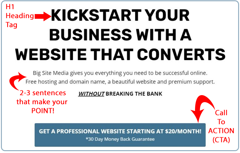
Write a Compelling Headline and Subheading
It is the largest piece of text on any landing page. It is placed above the fold and it is the first thing visitors see when they land on the page.
Of course, we are talking about the headline. Marketers will always emphasize a headline because it serves as an immediate conversion driver that convinces users to take action instantly. It has to be very short but highly persuasive and interesting.
A subheading follows the headline, but this time you have two or three sentences to explain the unparalleled quality of your offer. Use it cleverly because too many consumers never make it past this landing page point.

Add a Hero Image to Landing Page
As a visual medium of communication, your landing page is the right place to add a hero image and support the copy. Three details are extremely important here:
- Use a high-quality image that perfectly corresponds with the text.
- Show real people because website visitors prefer seeing human faces rather than objects.
- Just in case you don’t know, a hero image should always be placed above the fold.

Include a CTA and Make It Big
A call to action (CTA) is the reason why you decided to build your one page sales pitch in the first place. It’s a trigger customers need to pull in order to complete the purchase or sign up for one of your services.
In such circumstances, it is vital to include the same CTA both above and under the fold. You also need to make it big and separate it from the rest of the content, thus helping everyone to spot it as soon as they land on your page.
The bonus tip is to create a CTA button using a color that contrasts the dominant background color of the landing page.
Match the Landing Page with a PPC Ad
How do you inspire customers to land on your sales page? We bet you’re using PPC ads, so you better make sure that it matches the intention of a given ad.
The reason why we are saying this is that too many small businesses promote one type of content or product through online ads, but they end up taking visitors to the landing page with a completely different purpose. Such practice is called ‘misleading’ and it is a genuine conversion killer.
Write a Convincing Copy
It is supposed to be brief and concise, but it still leaves you with enough room to write a bit longer copy. This is your chance to show what makes the offer so sensational and convince readers to give it a try. The nature of your lead magnet determines your copywriting style, but here are some universal rules that apply to all landing pages:
- Be focused and avoid generic copies
- Make it sound actionable and inspiring
- Use an upbeat tone
- Present a common problem and explain how you can solve it
Take Advantage of Social Proof
Modern consumers are getting tired of traditional ads and sales pages, so they seek additional trust signals. These come in the form of social proof, a detail that often makes the difference between poor and amazing landing pages.
The good thing about social proof is their flexibility. For instance, you can create a video case study with one of your clients. If that’s too much for your marketing appetite, you can use a simpler alternative and place clients’ images along with brief comments about your work. Other relevant types of social proof are:
- Consumer reviews
- The numbers of purchases and social media shares
- User rating
- Influencer endorsements
- Credentials and badges
Concentrate on Sales Generation
We need to remind you once again that these are meant to be sales drivers. As such, they must be designed with sales generation on your mind. This means using only one type of CTA per landing page since you don’t want to confuse visitors and make them wonder what to do next.
You should also eliminate popups because they distract people. Finally, use enough whitespaces to separate headings, subheadings, copies, images, CTAs, and all other elements that end up on your page.
Be Ready for Some Testing
There is a big secret that you won’t be hearing too frequently, but we will say it loud and clear: No one ever makes it perfect at first.
Our advice is to be ready for some testing if you want to polish the landing page and really make it convert. Every aspect of this is subject to testing – a headline, a CTA, etc. You never know what the audience really likes until you compare multiple variants, so the only way to figure it out is by testing and improving.
Big Site Media Designs High-Converting Landing Pages
It takes a lot of experience and web design proficiency to build a powerful landing page, which is why the vast majority of small businesses leave it up to professionals like Big Site Media.
Our team of web designers will turn your landing page idea into eye-pleasing content, while our copywriters guarantee to create an actionable piece of text for you. Your customers deserve an appealing landing page - make sure to build one with Big Site Media!

